Japanese Candy Packaging
Client: Bourbon
Problem
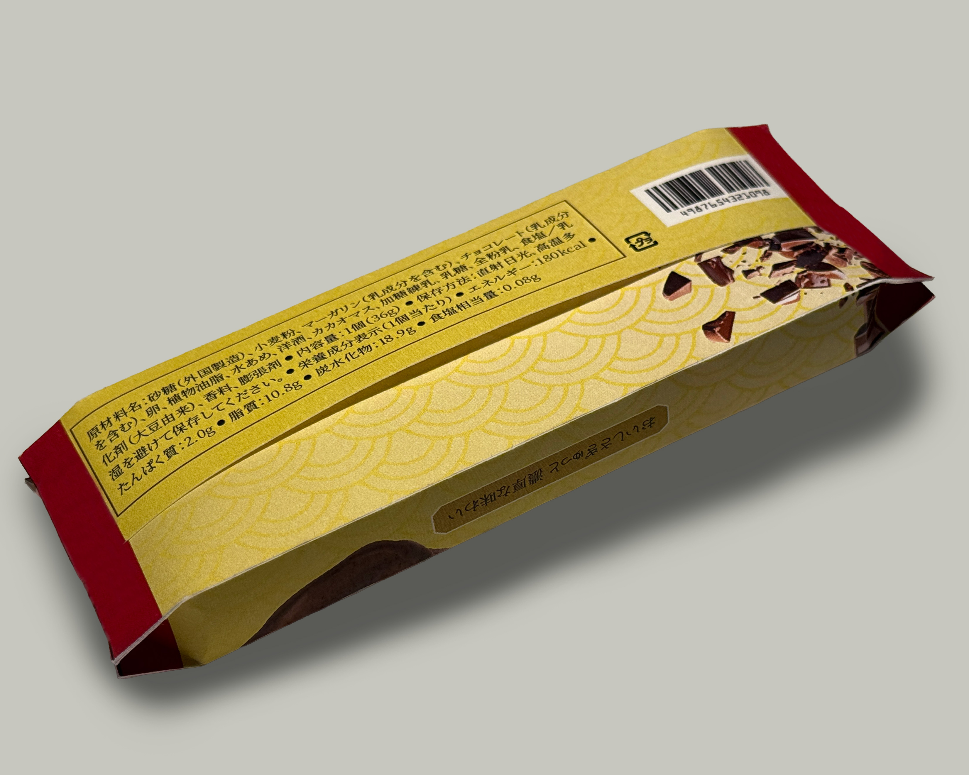
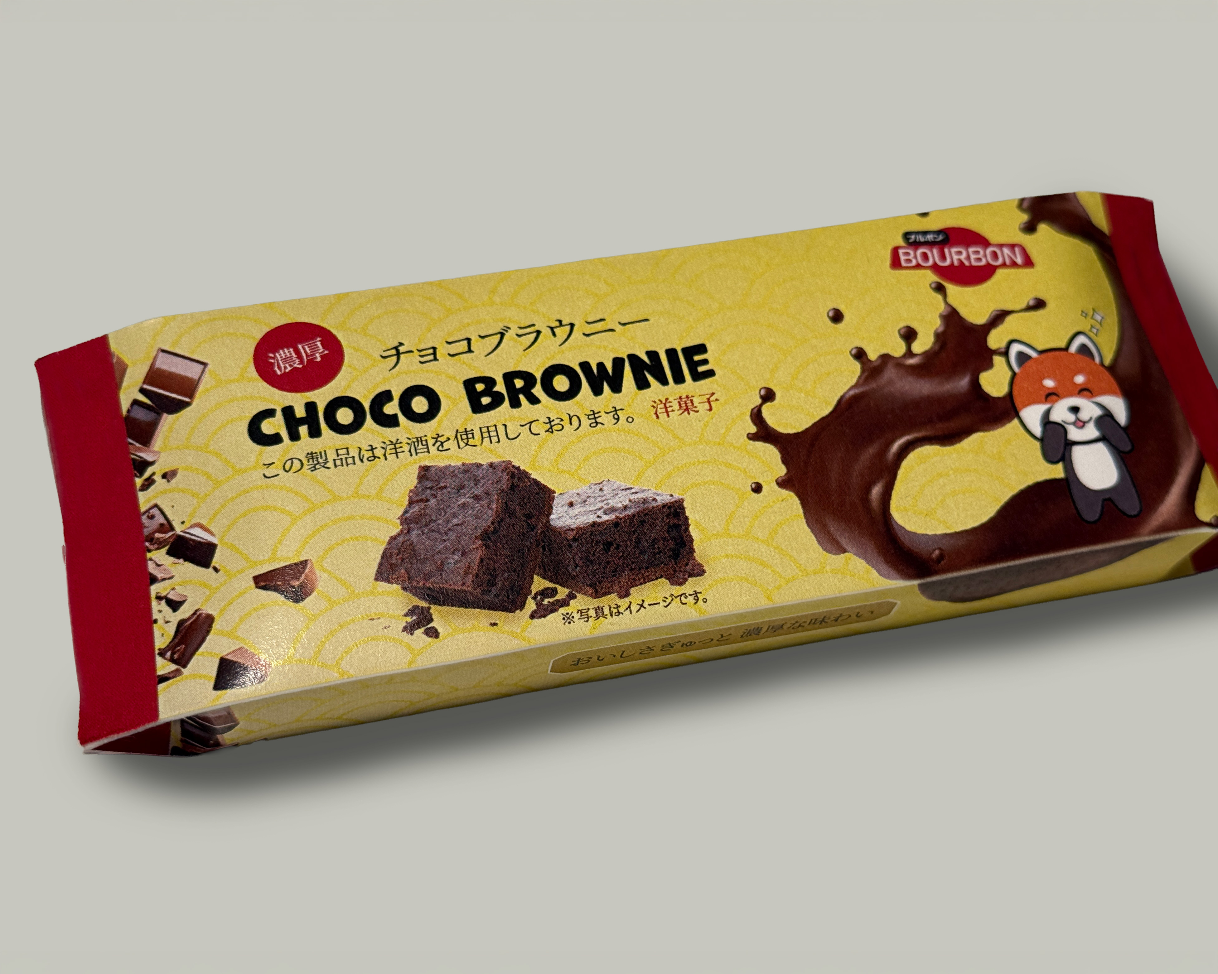
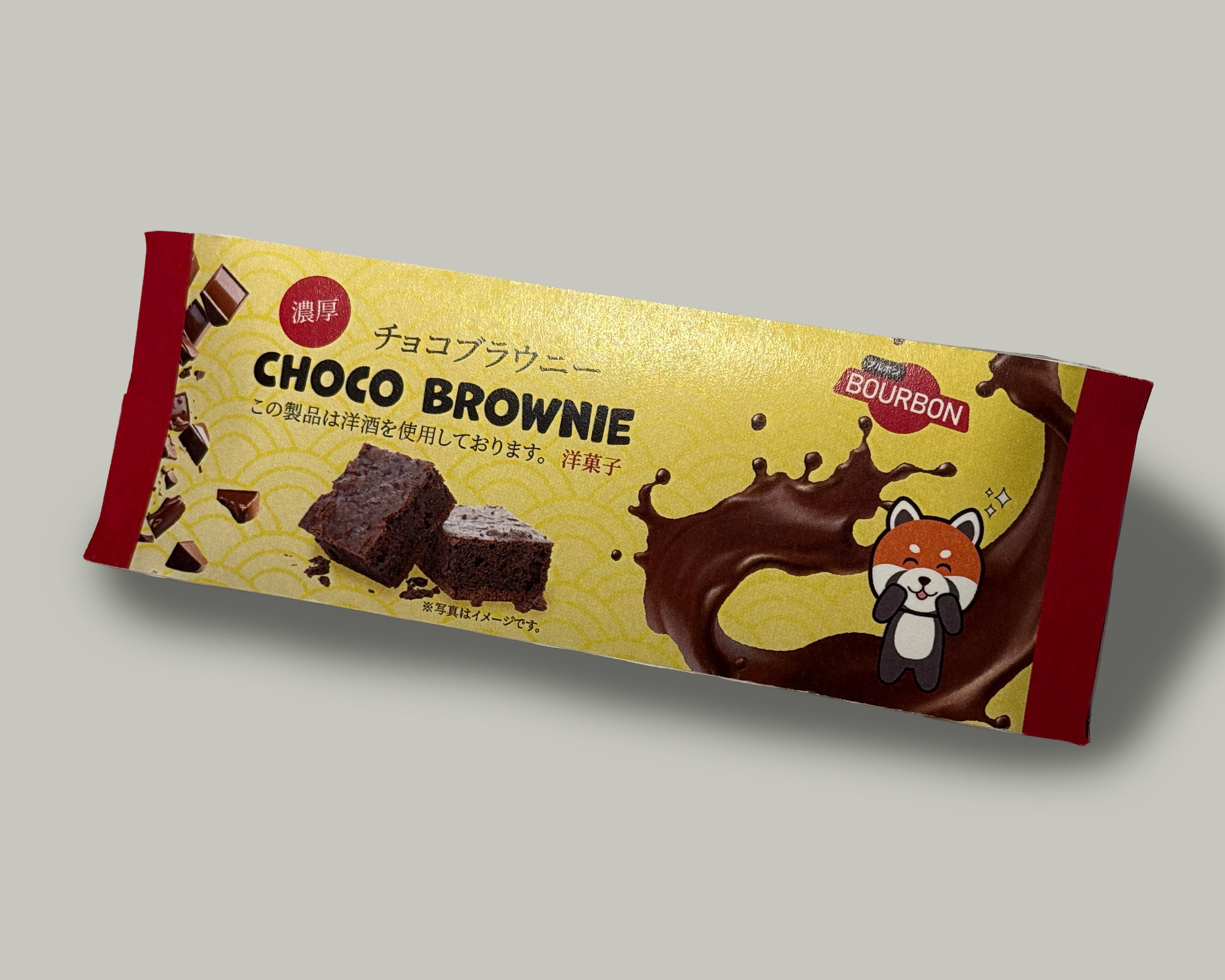
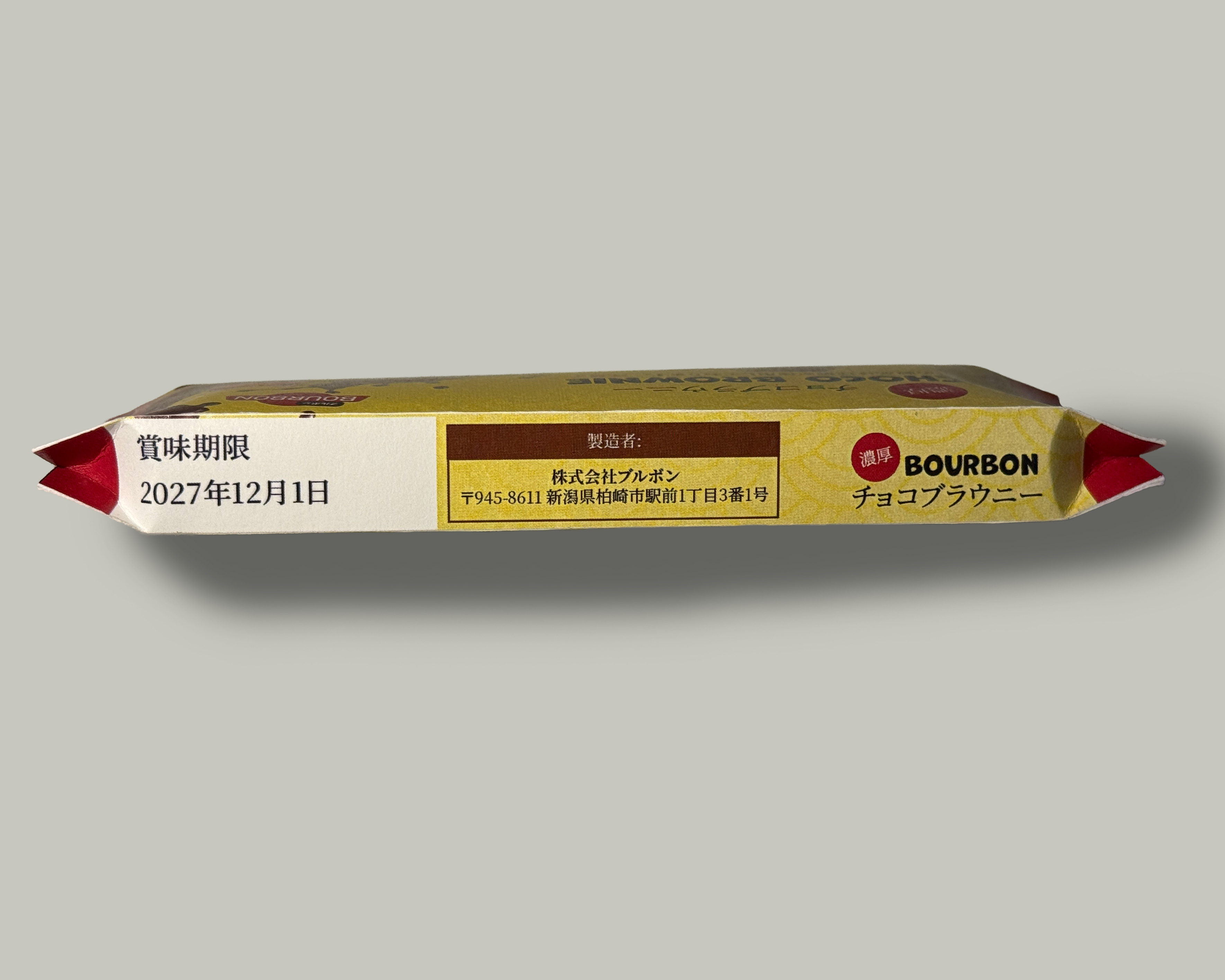
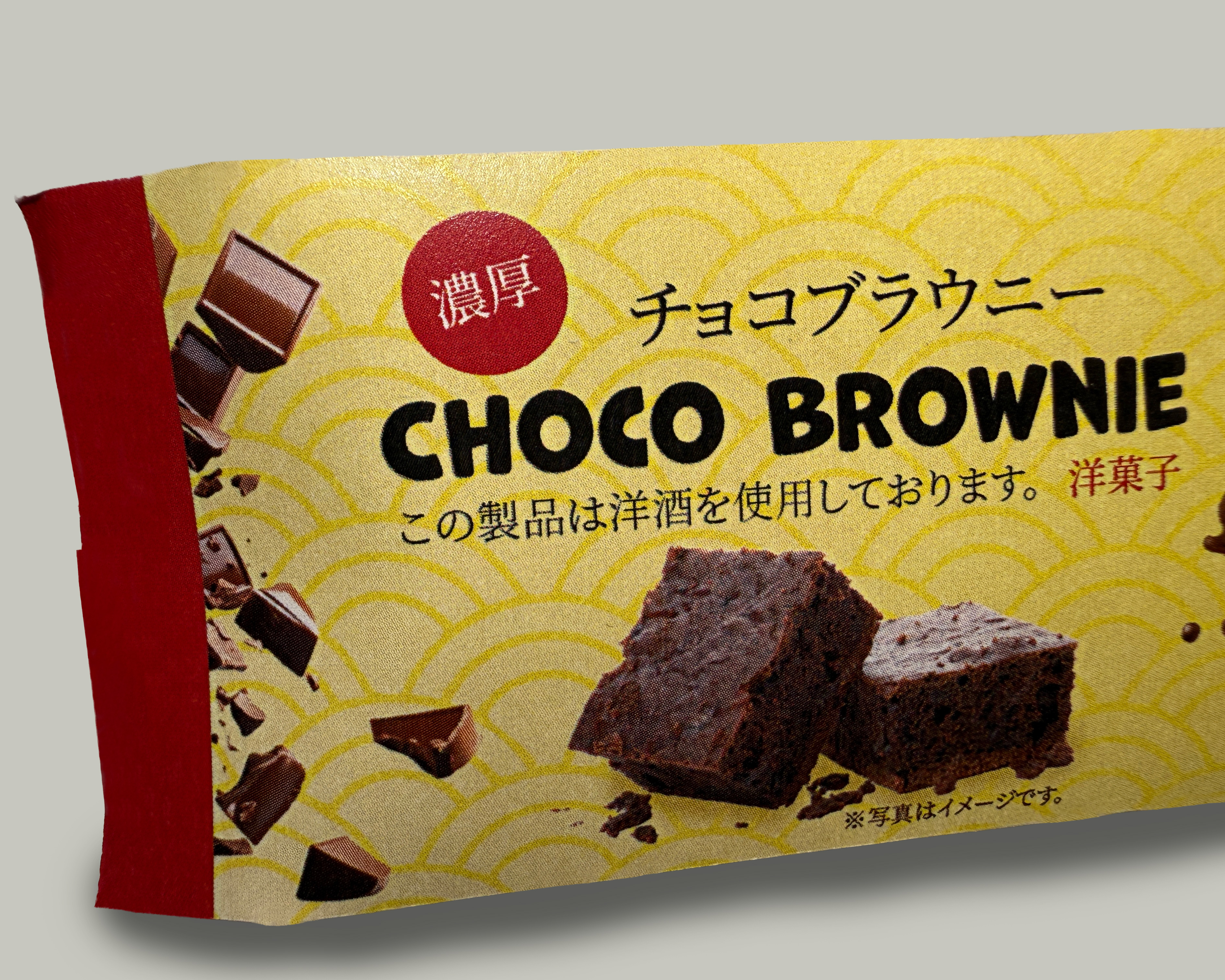
Bourbon wanted to reposition an airplane brownie treat for the Japanese market and introduce it into retail stores in Japan. The packaging needed to appeal to Japanese consumers while aligning with local visual conventions and food packaging expectations.
Solution
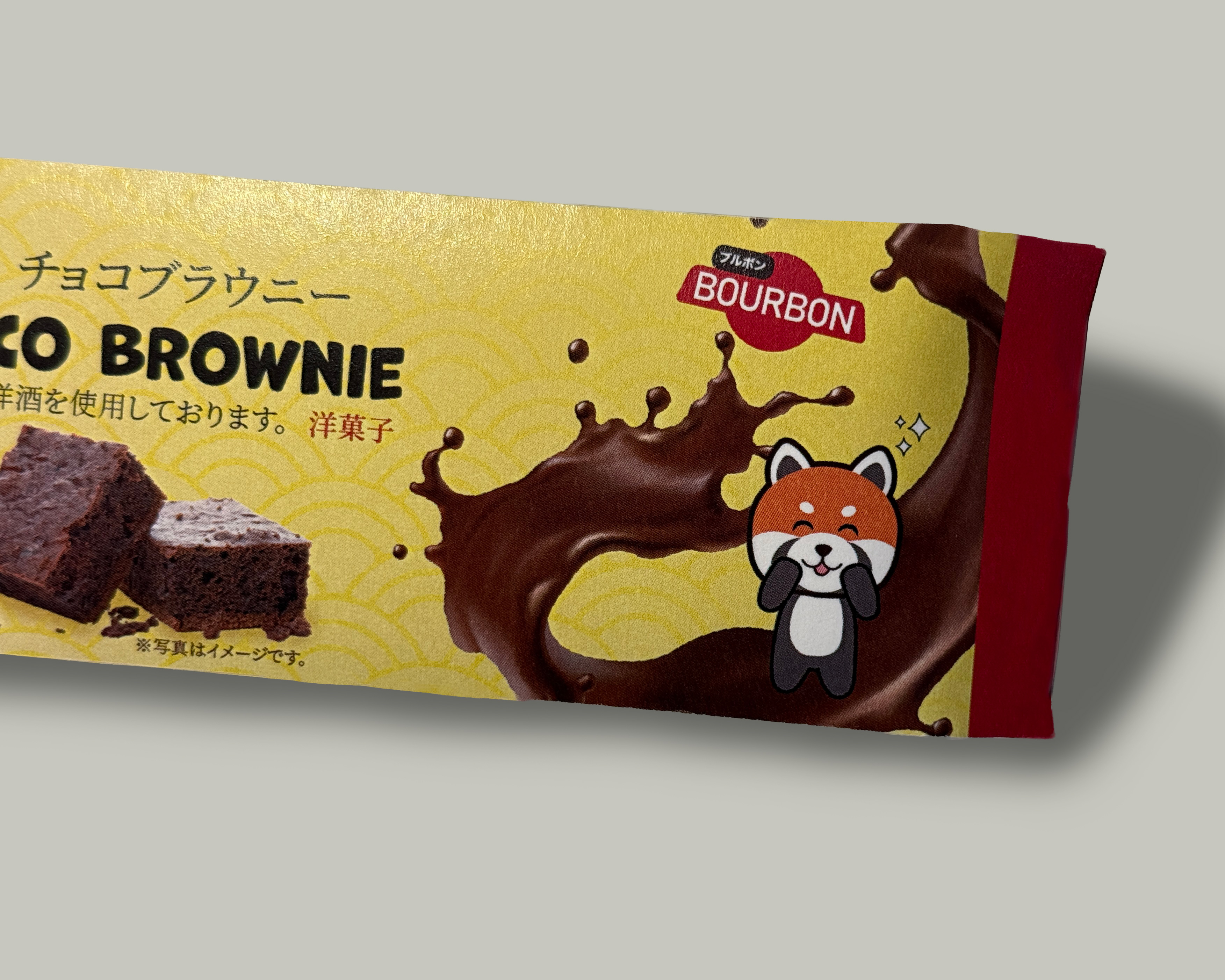
The packaging was designed using a kawaii-inspired visual style to resonate with a Japanese audience. A red panda character was incorporated as a recognizable and culturally familiar animal, paired with a color palette that reflected the chocolate product while signaling quality. The design emphasized motion and visual energy, drawing from common characteristics of Japanese packaging. Real product imagery was combined with illustrated elements to balance realism and playfulness, while textured backgrounds and added noise were used to create depth and visual interest.